How to mix colours from the three primaries, with a mixing chart
Researched by Abu Bakar Saadat7 min read
Last updated: 15 November 2026References
 Illustration
On this page 9 sections
In short
Mix neighbours: yellow and blue make green, yellow and red make orange, red and blue make purple. For bright mixes use two versions of each primary, one leaning each way. A touch of the opposite colour dulls a mix; white makes it lighter.
At a glance
- Green
- Yellow + blue
- Orange
- Yellow + red
- Purple
- Red + blue
- Dull or grey
- Add the complement
- Lighter
- Add colour to white, a little at a time
- Advice from
- Winsor & Newton, Daniel Smith, Just Paint (Golden) and Gamblin, read 28 October 2026
- Checked
- November 2026
Muddy greens and greyish purples are such a letdown when you can picture exactly the colour you want. Usually the paints are to blame, not you, and a handful of rules sorts out most of it.
Three primaries, yellow, red and blue, mix into all the secondaries and a wide range of browns and greys. But which yellow, red and blue you use makes all the difference. Winsor & Newton lists "three colour" mixing systems for exactly this, and recommends transparent colours for mixing "to ensure clean mixes".
Three paints or six: which palette is for you?
Starting out, or fewer tubes
Three primaries: one yellow, one red and one blue, such as the Winsor & Newton three-colour sets in the table below.
You want the brightest greens, oranges and purples
Six: add a yellow, red and blue that lean the other way. Winsor & Newton calls this its six-colour system, and Daniel Smith and Gamblin call it a split-primary palette.
Which three paints to start with
To give you a place to start, these are Winsor & Newton's own recommended three-colour primary choices for several of its ranges, and other makers' equivalents work just as well.
| Range | Yellow | Red | Blue |
|---|---|---|---|
| Professional Watercolour | Winsor Lemon | Permanent Rose | Winsor Blue (Red Shade) |
| Cotman Watercolour | Lemon Yellow Hue | Permanent Rose | Ultramarine |
| Professional Acrylic | Azo Yellow Medium | Permanent Rose | Phthalo Blue (Red Shade) |
| Galeria Acrylic | Transparent Yellow | Permanent Rose | Ultramarine |
| Artists' Oil | Winsor Lemon | Permanent Rose | Winsor Blue (Red Shade) |
How to mix the colours
Lay the colours round the palette in order, starting with yellow.
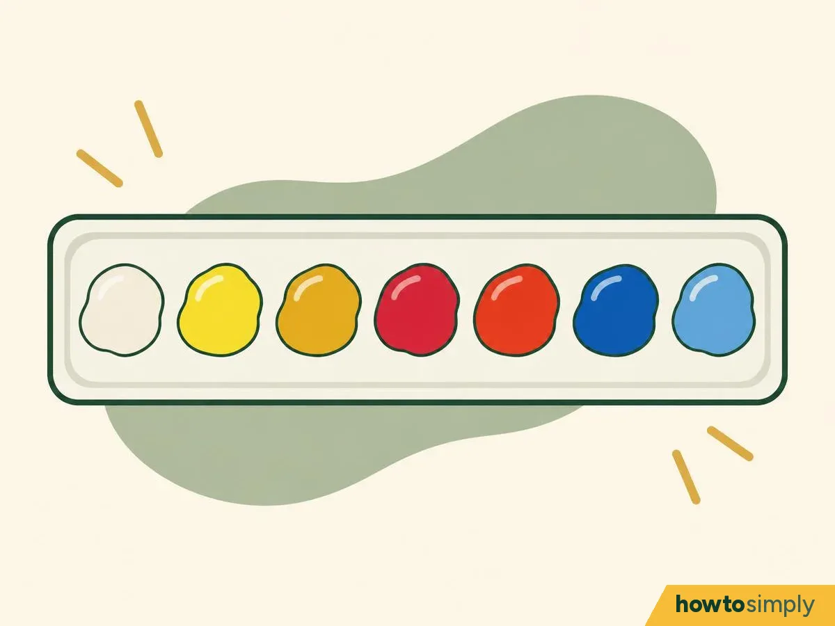
Illustration Put the colours round the edge of the palette in order, starting with yellow, and white next to the yellow so dark colours don't get into it (Gamblin).
Keep a jar of clean water or medium and a rag ready, and make sure you clean the brush between colours, because old paint left in the brush will creep into the next mix.
You should see: yellows, then reds, then blues round the edge, with the white beside the yellow and space in the middle for mixing.
Mix each secondary from the two primaries that lean towards each other.
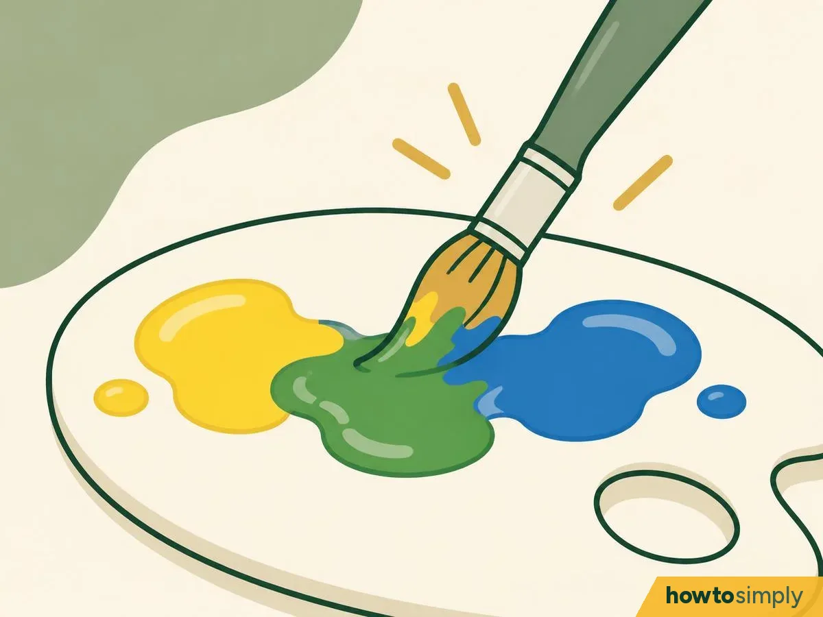
Illustration 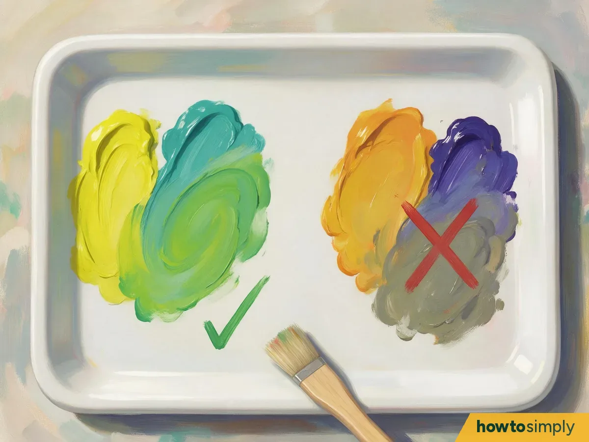
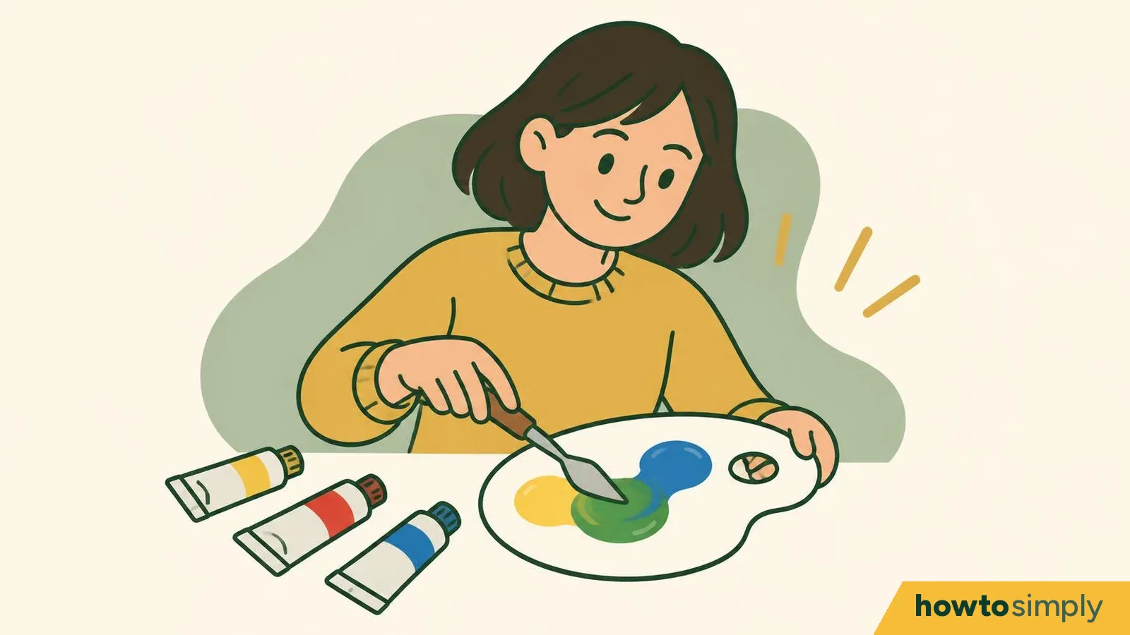
Illustration: mix from the two primaries that lean towards each other for a clean secondary Yellow and blue make green, yellow and red make orange, red and blue make purple. Daniel Smith's rule is to "stay in each section" of the colour wheel; crossing into another section brings in some of the third primary, and the mix goes greyer. So a green goes greyer when a little red, the third colour, gets into the mix.
The mixing table below names the paints for the brightest and the softer versions.
You should see: a clean green, orange or purple in the middle, not a greyish one.
Dull a colour that's too loud with a touch of its complement.
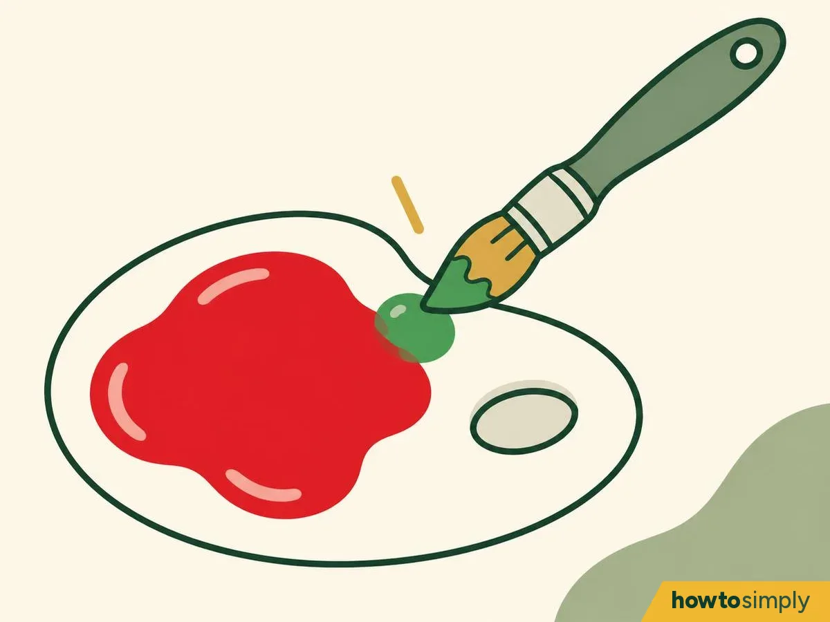
Illustration Next, a colour that is too loud. Add a tiny amount of the colour opposite it on the wheel. Just Paint says small additions tone a colour down without changing what colour it is.
Black also tones it down, but it darkens the colour and changes its opacity (Just Paint). The painter writing on Gamblin's site says that creating a shadow colour by simply adding black deadens shadows. So if your habit is to reach for the black tube every time a colour shouts, its opposite on the wheel will do a far kinder job.
You should see: the same colour, only calmer. If it turns grey or brown, you added too much of the complement.
Lighten by mixing a small amount of colour with white.
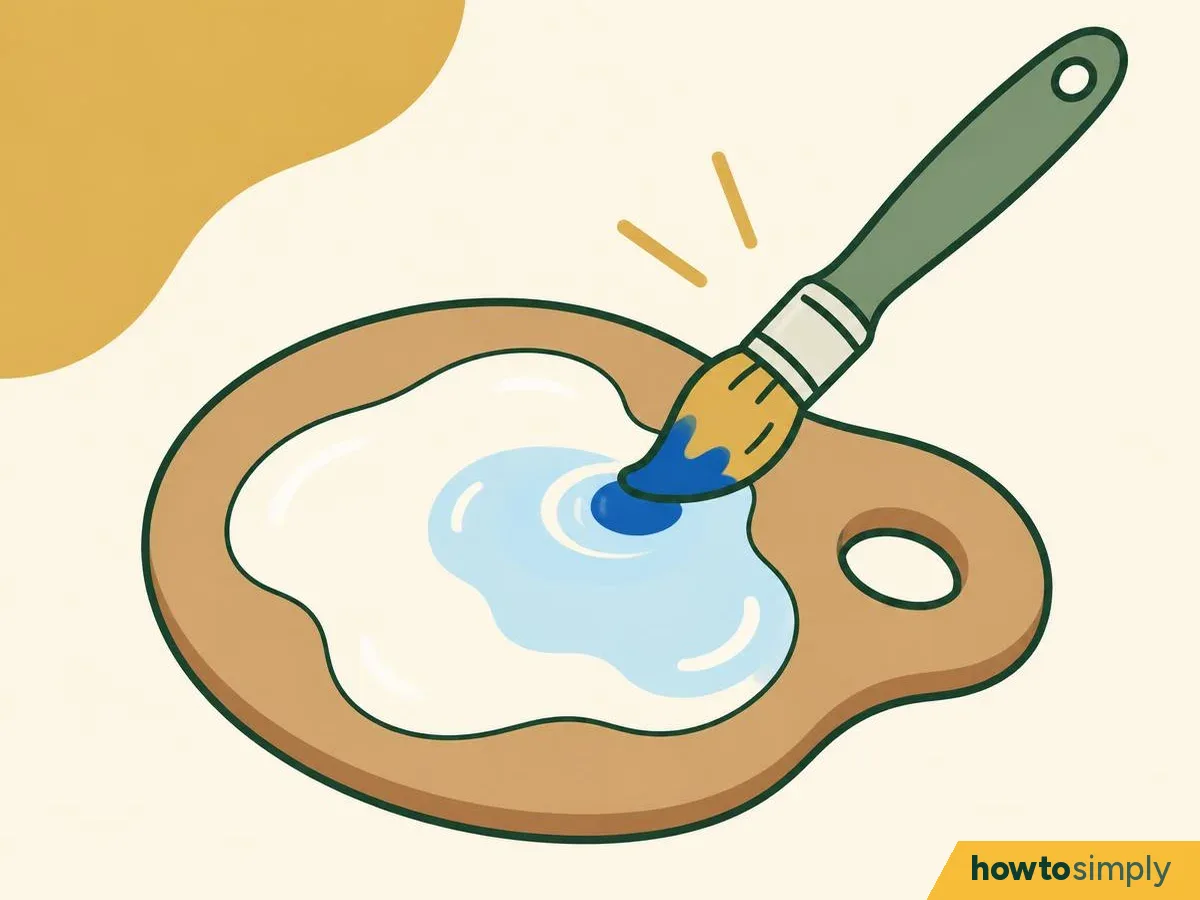
Illustration Start with the white and add the colour in small touches. A little colour goes a long way, and this way you won't end up with a big pool of leftover paint. Winsor & Newton's sky blue is just a small amount of ultramarine mixed into titanium white. White also makes a colour less intense and more opaque (Just Paint).
In watercolour you lighten with water instead of white.
You should see: a pale tint that you reached in small steps, without a big pool of leftover paint.
Correct a mix by adding the colour that moves it the way you need.
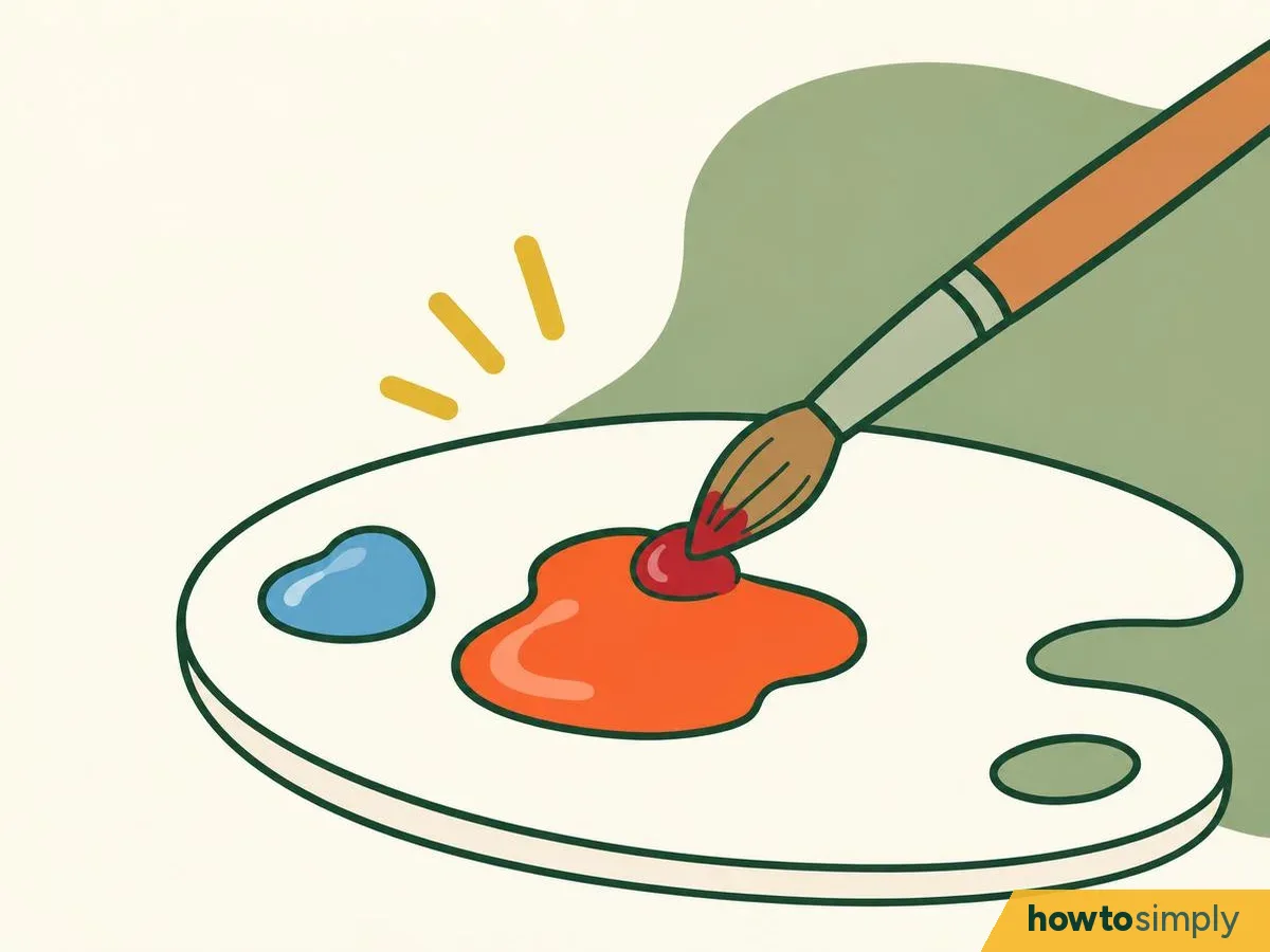
Illustration Don't worry if a mix isn't quite right the first time. Add more of the colour that moves it the way you need. If that isn't enough, use the next colour along on your palette (Gamblin).
For example, the Gamblin painter cools a scarlet with a little alizarin, then with ultramarine for a stronger change.
You should see: the mix shifting a little with each touch. Test it on scrap paper and let it dry before you decide.
Paint your own mixing chart.
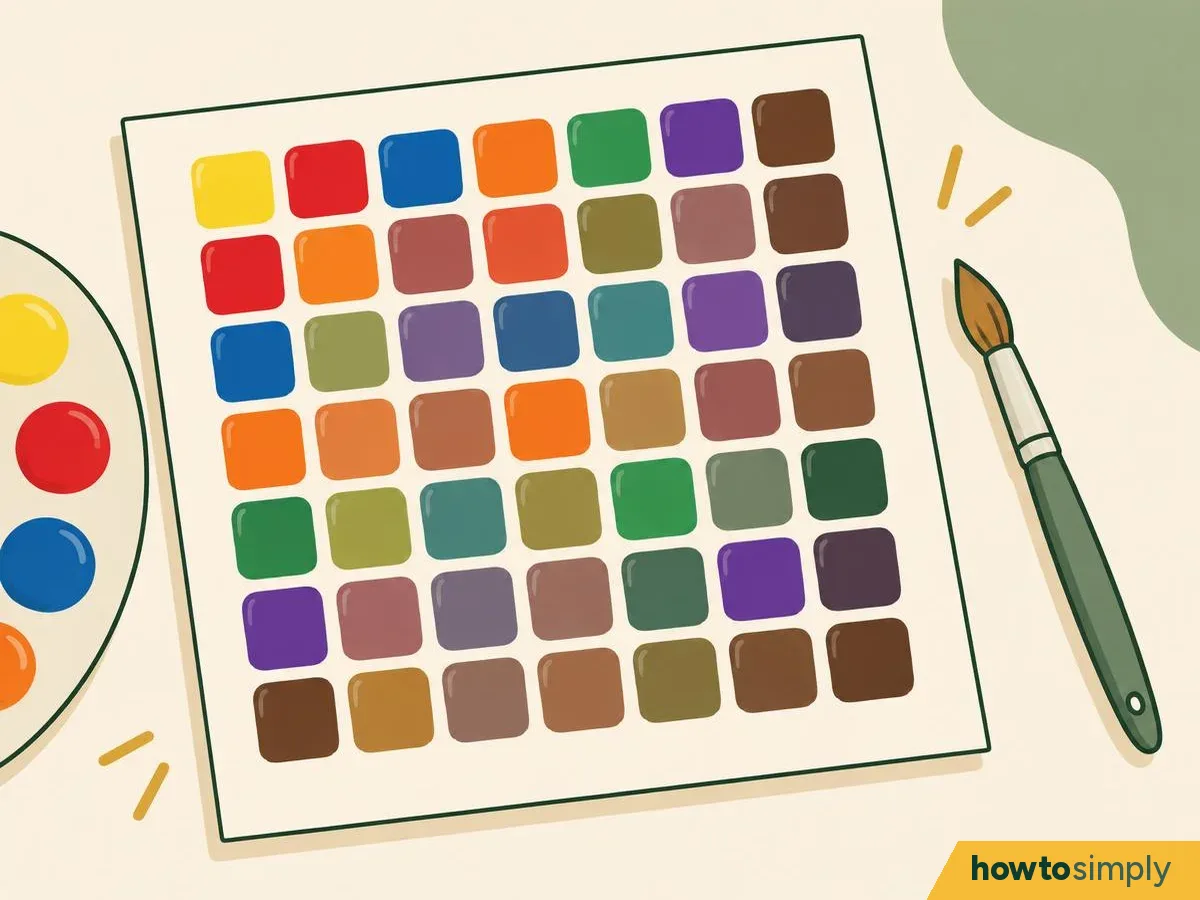
Illustration Rule a grid with your paints along the top and down the side. In each square, mix more of the row colour and less of the column colour (Daniel Smith). Write the paint names in pencil at the edges. What it will do, it gives you your own map of what your paints can make, and it is fun to fill in.
You should see: a grid that shows what your actual paints do, which no printed colour wheel can.
Mixing table
| You want | Mix | For the brightest result (Daniel Smith's palette) | For a less intense, slightly greyer result |
|---|---|---|---|
| Green | Yellow + blue | Pair a cool, lemony yellow (Hansa Yellow Medium) with a blue that leans towards green (Phthalo Blue Green Shade) | Use the red-leaning blue (ultramarine) or a warm yellow |
| Orange | Yellow + red | A warm yellow (New Gamboge) + an orange-leaning red (Pyrrol Orange) | Use the pink-leaning red (rose) |
| Purple | Red + blue | A pink-leaning red (Quinacridone Rose) + a red-leaning blue (French Ultramarine) | Use the orange-leaning red or the green-leaning blue |
| Grey | A colour + its complement (red + green, blue + orange, yellow + purple) | Complements mixed together cancel out towards grey or black (Just Paint). Add white for lighter greys | |
How to tell it worked
- Your greens, oranges and purples look clean, not muddy, as Daniel Smith describes.
- A dulled colour is still recognisably the same colour, as Just Paint explains.
- Each mix still looks right after it has dried on scrap paper, not just while it's wet.
- Your mixing chart is dry, and every row and column is labelled in pencil.
If it goes wrong
A muddy mix isn't a sign that you're bad at this. It happens to everyone, and each problem below has a clear fix.
| What happens | What it means | What to do |
|---|---|---|
| Green or purple looks muddy | A third primary has crept in (Daniel Smith) | Swap one paint for the version that leans the other way (see the mixing table) |
| The mix is too dark | Too much of the dark colour went in | Start again with the lighter colour and add the dark one bit by bit; it's quicker than rescuing a big dark puddle |
| The colour changed as it dried | Paint can look different wet and dry | Test each mix on scrap paper and let it dry before you use it |
| Mixes keep turning grey | Old paint in a dirty brush or in the water is getting into the mix | Clean the brush between colours: see how to clean paint brushes |
Questions readers ask
Can I really mix every colour from three primaries?
Most of them: Daniel Smith says that from these primaries, most other colours can be mixed. Winsor & Newton lists six-colour primary systems as well as three-colour ones.
Why do my mixes turn muddy?
A third primary may have crept in. Daniel Smith explains that a mix goes greyer when it contains a touch of the third colour, for example a blue that leans towards red in a green mix. Dirty brushes and water do the same.
How do I make a colour less bright without making it darker?
Add a tiny amount of its complement. Just Paint says small additions of the complement tone a colour down without changing its identity. Black also dulls it, but darkens it and changes how opaque it is.
How do I mix brown?
Daniel Smith mixes earth colours by crossing over the lines on the colour wheel, or by adding a warm neutral such as Quinacridone Burnt Orange. Complements dull each other towards grey or black (Just Paint), so stop when it turns brown.
Sources and method
- Researched by
- Abu Bakar Saadat
- Tested by our team
- No. We have no record of anyone on our team trying these steps, so treat them as researched instructions from the sources below.
- Pictures
- 8 illustrations drawn for this article, each marked Illustration (drawings, not photos).
- Sources
- 7 named sources, linked below.
- What this page adds
- A mixing table pairing paints for bright or softer greens, oranges and purples, a starter table of three paints for watercolour, acrylic and oil, and a guide to painting your own chart.
What to do next
Learn to draw and paint from scratch Step 3 of 7
Did this solve the problem?
Where did you get stuck?
What did you think?
Reaction counts are loading.
Sources
We use primary, official and specialist sources appropriate to the topic.
- Winsor & Newton: Primary colours in the Winsor & Newton watercolour ranges
- Winsor & Newton: What are the primary colours in Winsor & Newton acrylics ranges?
- Winsor & Newton: Primary colours in the Winsor & Newton oil range
- Winsor & Newton: Colour recipes, how to mix the top six requested colours
- Daniel Smith (Susie Short): Working with a split primary color palette (21 July 2022)
- Just Paint, Golden Artist Colors (Scott Fischer): Neutralizing color (archived copy of 2 September 2026; page since removed)
- Gamblin Artists Colors: Understanding color temperature within painting